Sunday, July 28, 2013
CHAIR DESIGN COMPETITION!
I am so excited to see great local design events happening here in SLC! Hosted by Mod a-go-go, a great new midmod furniture and contemporary art showroom on South Temple, I know this will be a great event, showcasing some amazing pieces. Please spread the word and join the competition! Entry info can be found here- http://www.modagogo.com/design-showdown/.
Labels:
Furniture,
Mid-Century Modern,
Salt Lake City
Wednesday, July 24, 2013
LOVE THESE CHAIRS
It is not hard to find some great inspiration browsing through House Beautiful and Architectural Digest in the evening (yes, I still read actual, paper shelter mags). I was on the lookout for some amazing upholstery or interesting chair shapes, and I stumbled upon so beauties pretty quickly. I just had to share-
From Architectural Digest, Aug 2013-
Love the shape of this adorable settee, and would love to get my hands on it to update the fabric! Probably not going to happen...
And this neoclassical settee is fantastic in its abstract animal print-
This traditional and simple shape works great with the bold, fresh polka dot-
And from House Beautiful, July/August 2013-
Great detail of the navy trim with pewter nailheads-

(and ps, just LOVE the bold interiors in pastel colors on both covers, baby blue and pink... almost as if they coordinated...anyone thinking subtle royal baby tie in...?)
From Architectural Digest, Aug 2013-
Love the shape of this adorable settee, and would love to get my hands on it to update the fabric! Probably not going to happen...
And this neoclassical settee is fantastic in its abstract animal print-
This traditional and simple shape works great with the bold, fresh polka dot-
And from House Beautiful, July/August 2013-
Great detail of the navy trim with pewter nailheads-
LOVE everything about this image, of course, my favorite colors b&w & grays-

And these cuties are adorable in this monochrome kitchen, with such a great contemporary print that feels completely at home on the neoclassical frames-
(and ps, just LOVE the bold interiors in pastel colors on both covers, baby blue and pink... almost as if they coordinated...anyone thinking subtle royal baby tie in...?)
CHRISTA PIRL FURNITURE
I am so excited to finally, officially launch my new venture in the world of design- Christa Pirl Furniture. Meant as a sister company to Christa Pirl Interiors, I have been itching to expand into furniture design for several years now, as I think many designers do. It seems a natural evolution, instead of selecting other people's furniture to go into projects, why not create your own pieces that fit into your own design vision? My favorite selections for clients have always been antique or vintage upholstered pieces that can be reinvented with a new bold, graphic (and often black&white) fabric. So I figured since I loved this part of my already fantastic interior design career so much, why not do it some more?
Of course I am not only looking to supply pieces to my own clients, but also to many others, people that share my love of unique vintage and antique furniture, and who see the potential in up-cycling furniture, and understand that while on the surface, a piece can appear as though its best days are behind it, yet often this is not the case. I am so happy to see the growing trend among my own Gen Xers as well as the Gen Ys to see the potential in old things, reusing these old things, and also their desire to create a home not piece-for-piece out of a catalog, but a unique mix of objects from different periods, styles and price-points. It makes for a much more dynamic world of interior design, a world that my new furniture business can fit into quite nicely, I believe.
So whether you are looking for a special piece of antique furniture or just a cute, inexpensive vintage chair, or wanting to restore grandma's chair you inherited, I would love for you to check out the new website, and feedback is always appreciated!
www.christapirlfurniture.com
Labels:
Christa Pirl Furniture,
Furniture,
My Business
Saturday, June 29, 2013
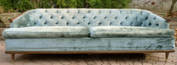
ANOTHER GREAT MID-CENTURY FIND
Granted, this loveseat looks pretty darn 'granny' at the moment, with its skirt and velvety yellow fabric, but before long, it will be looking very hip. It has a wonderful shape to it, its low back broken by an elegant little pinch right where the back turns into the arms, very 'Japonais', very Frank Lloyd Wright... and all that tufting on the back, think of how great that will look with a graphic pattern?! We plan on removing the skirt to expose the straight legs behind it (and possibly even replacing existing legs with a new tapered mid-century style leg which will give it even more of the feel of the period), and creating one seat cushion instead of 2- making it feel much more streamlined. All bold, no granny! It is always fun to look at what others have done with similar pieces, however, I was unable to find too many redos but certainly found a lot of comparable pieces...
And one great redo of a similar piece by Chairloom, love the dots, but not so much the skirt...
I am looked at a few possibilities for mine...
Very excited to get started!
AMAZING TRANSFORMATION
This house clearly had great modern bones, and my clients sensed this when they decided to purchase the home, but they needed a little help seeing the potential through all the turned balusters... and shiny brass... and... well, you will see!
In the main living space we removed the honey oak chair rail that cut the height of the room, removed the plantation shutters which completely opening the room to the fantastic view. A typical tan paint color was replaced with a very subtle neutral taupe that also helped bring the view into the room. The client's great light and bright modern furniture also contributed significantly to the open feel of the space.
BEFORE-


AFTER-
BEFORE-
AFTER-
BEFORE-
In the main living space we removed the honey oak chair rail that cut the height of the room, removed the plantation shutters which completely opening the room to the fantastic view. A typical tan paint color was replaced with a very subtle neutral taupe that also helped bring the view into the room. The client's great light and bright modern furniture also contributed significantly to the open feel of the space.
BEFORE-


There were two major elements in this main living space that really hindered the modern feel of the house, and these just had to go. The first was the country-style stair rail and balusters. We needed a modern feel, yet still had to be sure the stair felt as though it belonged in the house. Instead of going super-contemporary with steel and cable, we simplified and squared everything off, with a new newel post, balusters and handrail, all with a sleek feel, yet still warm and in keeping with the tone of the house. The change was quite striking.
BEFORE-
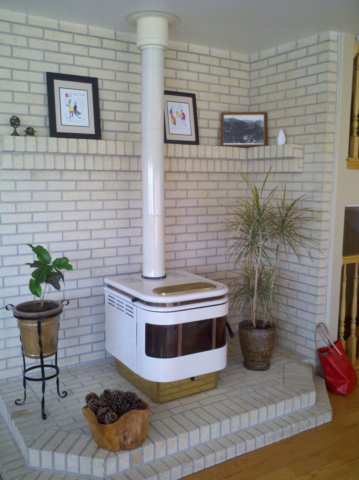
And probably the item that screamed 'renovate me' the most, was the retro 70s style stove surrounded by white brick directly next to the staircase. In the center of the space, next to the dining room, living room and kitchen, this desperately needed to be turned into an attractive central feature in the home. So we removed everything and started from scratch creating a modern and inviting fireplace with a bench hearth perfect for perching on a cold night.
BEFORE-
AFTER-
It is always so rewarding to see a space completely transform without actually starting from scratch. Now the honey oak floors and stairs tie into the new fireplace mantle, and add to the space, rather than overwhelm the space, giving it that great mid-century warm modern feel. Everything feels open, fresh, and new. Thank you my excellent clients for making this project happen!
Labels:
Mid-Century Modern,
My Design Projects
Subscribe to:
Posts (Atom)