Friday, September 24, 2010

A COMPANION PIECE FOR MY LION FRIEND

Last weekend as I was perusing a local flea market, I came across the above architectural remnant which I could simply not resist.  For some reason any broken down somewhat classically inspired hunk of stone just calls to me.  Luckily, this hunk of stone was priced extremely well, at only $20! Sold.  How perfect, now I have a stately crest outside my front door, and a stately lion inside.  OK, os it might not be the most stately crest ever....sure, its a little small...maybe the term 'dinky' could even be used.  But hey, its still cool, right?  Just not quite as impressive as some of these:


But hey, I am in Salt Lake, not Paris, and it was only 20 bucks.  I will take what I can get. 

My little condo is beginning to scream aristocrat.  Well, I am still working on it, but it's coming along. Next purchase: some ivy, growing up the crest....


Although my condo board might not be so thrilled if I go too crazy with the ivy :)


Saturday, September 18, 2010

CHRISTO, AT&T, AND MY ART HISTORY CLASS

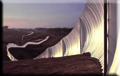
I am currently teaching a 101 college level art history class, and many of these students have had very, very limited exposure to art prior to this class. Yes, this past Wednesday evening, as we discussed Environmental Art, I was completely and utterly thrilled when I flashed up this image by Christo (an artist none of them had heard of prior):
 

and several of my students happily exclaimed: "It's just like the AT&T ad!"  Well, I must be a good teacher...or the connection is so blaringly obvious you really don't have to have much of a visual eye at all to see it. "Yes!  That is exactly right", I told them,....it is JUST like the AT&T ad.  Except Christo did it long before AT&T ripped him off.  Here is Valley Curtain  from 1972:


And his Gates from 2005:

 
And here is AT&T's version:


And more AT&T:


Here is Christo's Wrapped Reichstag from 1995:

And here is AT&T's version of wrapping buildings:


A poll by Huffington Post readers determined that 85% of people felt this was a complete rip off and not just a coincidental similarity.  Regardless to say, Christo and his wife/business manager protested and threatened to sue.  Now, the ad airs with a very tiny disclaimer: "The artists Christo and Jeanne-Claude have no direct or indirect affiliation or involvement with AT&T." 

For god's sake people, his wife's hair is even the same color as the AT&T fabric!  Come on! (His wife, Jeanne-Claude, is now billed as an equally contributing artist in his installations, however, I refuse to give her equal credit.  Sure, she keeps him sane and makes sure he is not totally taken advantage of during the sale and execution of his artwork, but totally equal they are not.  He is the artiste.)


And just one more here: Christo wrapping the Gold Coast of Australia:


And Christo wrapping islands in Miami (fyi, I actually still have a small piece of this pink fabric from when I visited back in the mid-eighties.  It sure looked cool, but alas, there were a number of dolphins that perished during the installation):


And here is AT&T wrapping some coastline:


So you see, it's not even just the fabric wrapping idea in general that was pinched, but generally, AT&T stole all of his location ideas as well.  Check it out for yourself on You Tube: http://www.youtube.com/watch?v=9U1k8q5A0gk


Thursday, September 9, 2010

IRRESISTBLE ARCHITECTURAL DETAILING

I just started reading Devil In the White City by Eric Larson for the second time (one of my all time favorite books- please read) and just cannot stop thinking about all the great architectural detailing by Louis Sullivan and the like in late 19th century Chicago (not to mention all the weirdo exhibits at the world's fair).

I happened to take some photos of said detailing that has been preserved at the Met in New York, and thought I would share. Louis Sullivan was one heck of an architect, however, from all reports he was kind of a jerk. But hey, I guess many architectural geniuses are. I believe Frank Lloyd Wright might be among that crowd as well, along with Bruneschelli, Le Corbusier, anyone associated with the Bauhaus..... well you get the point. The architect in general truly believes his is some kind of god, creating and destroying buildings, even whole cities, in the blink of an eye. Of course those listed above were in fact geniuses, but come on, you can be a bit polite to your poor, overworked draftsmen, and not to mention your, ahem, interior designers. But I digress. Back to the architecture.

Here is some of the stunning metalwork on view at the American Wing at the Metropolitan Museum. Could you ever imagine such craftsman ship and such intricacy in our day and age?


And the most amazing thing is that much of this detailing was placed high above eye level, almost more for the enjoyment of the birds, superman, or perhaps your skyscraper neighbors.  I just cannot resist that geometric foliage he creates.  So much stronger and modern than traditional decorative work of the Victorian era, so totally appealing.

This brick and terracotta work is just as impressive:


I want some on my building please!

Here are some other shots of his work (not in the Met, obviously!):


Saturday, September 4, 2010

ANOTHER BLOG ABOUT THE OVAL OFFICE

I am sure the Oval Office redo is already old news, but I feel I need to throw my two cents in anyway.  First, I must say that I DO understand it is the Oval Office and therefore needs to be somewhat restrained.  And I also understand we are in the greatest recession since the Depression and no one wants to see Obama spending a fortune on an elaborate Oval Office redesign.  However, why bother at all when you end up with this?  And I hear the cost is equal to any other Oval Office redesign.


I don't get it. Especially when you are using Michael S. Smith (not confirmed or denied by the White House, however it is generally assumed he is the designer). Why bother? I was quite impressed with the choice of Smith when announced, as he does work which is quite refined and traditional yet also bold and fun. He is not a stuffy designer despite being traditional. However, this, I would say, is not Smith at his best. Overall I am disappointed. Maybe Obama wants to be seen as a 'man of the people', but I think this is going a little too far. This dull beige den furniture does not belong in the Oval Office...in my humble opinion.

 
Here is some of Smith's better work. I don't know about you, but I see NOTHING of this great design in the Oval Office space:


I hate to say it, but I do believe good old Bush (W) did it better.  This design is quite refined, as I feel appropriate for the location, however its not homey, its elegant and also throws in some color and pattern lacking the the Obama version.


Even though I do not care much for Clinton's version, at least it has some grandeur, some style, and some color!


So there.  My two cents.  Anyone else have any thoughts on the matter?