Thursday, June 24, 2010

GREETINGS FROM THE VERY MUGGY BIG APPLE

Well, I must say it's very good I no longer live in Manhattan because I fear I would abandon all my clients just to blog about exhibitions, buildings, and random design events ALL THE TIME! There is far too much going on here, and I must say I am almost looking forward to the slower pace of Utah, where there are, of course, always things to blog about, but maybe just one or two things per week instead of seventy. ALMOST.
Anyway, since there are so many things going on, and the memory stick in my pathetic little point-and-click camera is totally full, I decided to pick two things I most enjoyed over the past few days and am hoping you might enjoy as well. But don't worry, the other stuff will be on view later when I run out of Utah things to discuss.

So here we go....


NYC PART ONE: THE MET MUSEUM ROOF GARDEN


OK. So at first one must just bask in the glory of the view. Don't worry about reading the text on the artist, don't even look at the really cool installation. Walk directly out to the edge of the garden and behold - Manhattan in all its glory....


And some more....


And just a bit more....
(And yes, I know there is some green in here too, but I can handle nature as long as its highly manicured and framed by the glories of man.)  OK, now we can get on to the exhibition. Yes there is art, if you can pull yourself away from this view. Utah, you've got it good in the red rock department, but you just can't beat this for my taste. Sorry.

Every summer the Met's rooftop garden hosts a new art installation unique to this glorious spot. It is always a treat to visit, especially since they serve wine up here.  In the past the roof garden has seen the great works of:

Roxy Paine (2009) :


Jeff Koons (2008) :


Frank Stella (2007) :


And this year I was lucky enough to make it to a most interesting installation by Doug and Mike Starn entitled Big Bambu. Now, I think it might not be my absolute favorite I have seen in this locale, but it is certainly towards the top of the list. (I would say Ms. Paine pulled her Maelstrom installation off beautifully, however Mr. Koons, I was somewhat uninspired).

Instead of regurgitating everything I read there about the artist's intent, I will merely quote the museum:
"The monumental bamboo structure, ultimately measuring 100 feet long, 50 feet wide, and 50 feet high, takes the form of a cresting wave that bridges realms of sculpture, architecture, and performance. Visitors witness the continuing creation and evolving incarnations of Big BambĂș as it is constructed throughout the spring, summer, and fall by the artists and a team of rock climbers. Set against Central Park and its urban backdrop, Big BambĂș suggests the complexity and energy of an ever-changing living organism."

Here you can see the still-developing cresting wave outline:


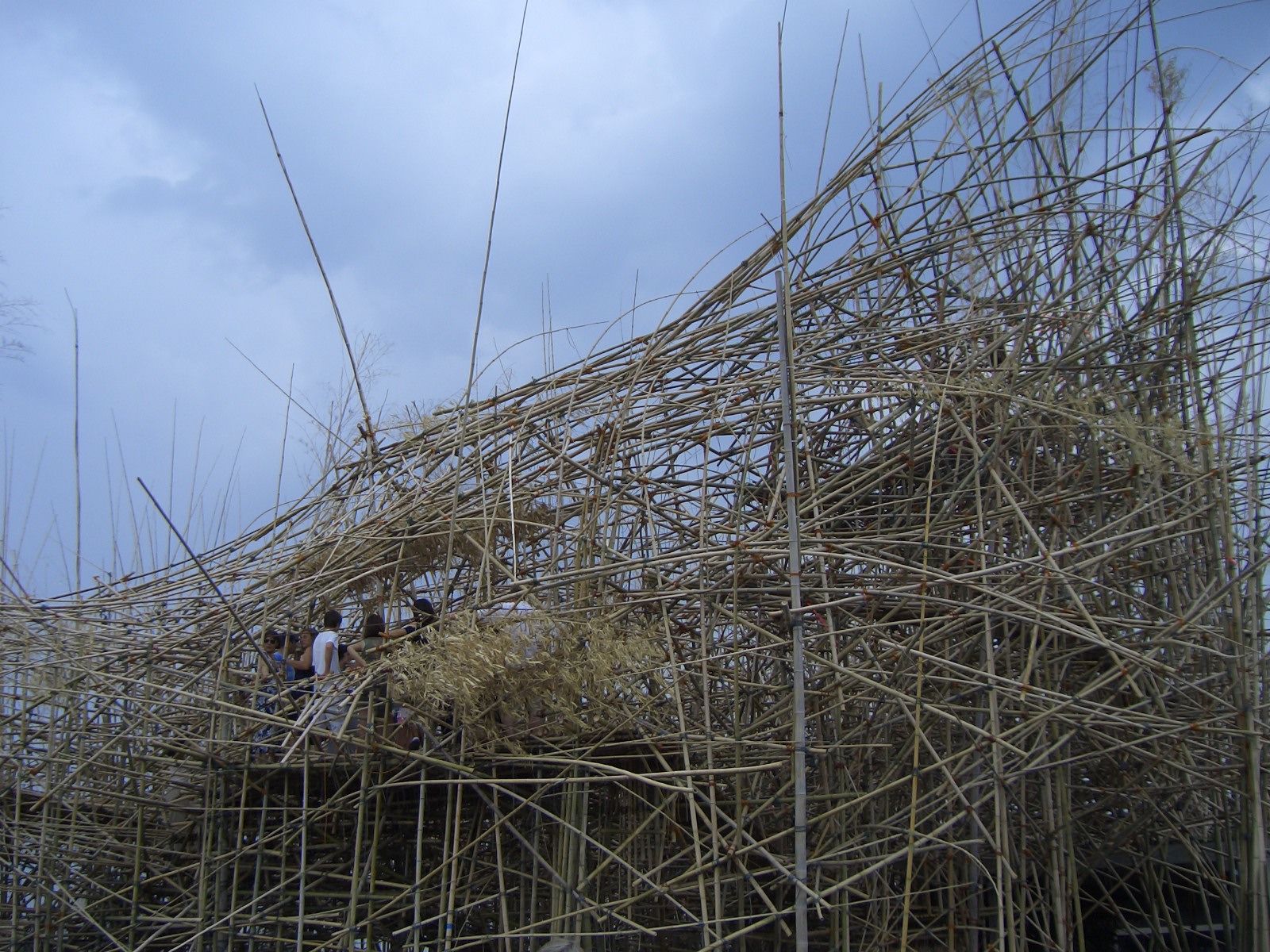
Big Bambu towers above the roof garden...not the most settling thing to look at when you are already on top of quite a high building. At least for me. I can only think of its ongoing construction and this amazing image from the Met website:
 
Although according to one insider, it is quite an amazing experiece to ascend up the walkways into the heart of the installation:


However, the uneasy feeling looking through the mess of reeds and out across the nothingness that hangs above Central Park, is countered by the density felt when walking under the stalks...it is almost as if you are in a forest and reminds me of Hawaii. It is quite peaceful looking up through the bamboo.


I would love to see it at night with these lights on and all the cast shadows.

Have you seen any of the above?  What do you consider the most successful...this is such a great space, it warrants someone really taking the location into consideration and accentuating...


NYC PART TWO: A FEW TOWNHOUSES IN MY DREAMS

So I thought after so much high art, we would just quickly stroll down the streets close to the Met (my absolute favorite area of NYC- the blocks between 60th and 90th between 5th Ave and Lex) and look at a few townhouses of my dreams.  This would not be the only place I would purchase property if I was a billionaire along Bill Gates' lines, but probably one of the first. 

1. #15, somewhere in the 60's (I have real thing for lion heads outside a residence...we will discuss that later....but this is just a beauty...refined and elegant, what more could you ask for?  Well, maybe the car out front too?!)


2. # 7 somewhere in the 70's (what a neoclassical beauty!  Very regal with beautifully proportioned  columns)


3. # 8 in the 80's (A much more subtle, Federal-styled townhouse)


4. The twins in the 90's (I would have trouble choosing between these neighboring houses...it would probably come down to the balcony on number 2...but then there is all that lovely ivy on number 1!)


Which one would you purchase with your Gates-style money and then have me decorate for you?  See you next week in the Land of the Midnight Sun!

Thursday, June 17, 2010

THE chair #1

Designers and architects often become fixated on one type of furniture, and often, it seems, it is the humble chair. And amazingly enough, I am no exception to that rule. I LOVE all chairs...the more bizarre, the better. Well, to some extent. I am not too sure about these.....

(Mathias Bengtsson's 'Slice' armchair ca. 1999, sold at Sotheby's for $42,500)


(Jon Brooks 'Styx Ladder back', 1985, estimated at Sotheby's at $15-20,000)

OK, I am actually lying....I think they are all pretty fab. As I long as I don't have to sit through a Norwegian dinner party in either of them.


I am constantly distracted from any task in my own home when I happen to glace over at my dining chairs...the wonder that is THE Bellini.
Mine are in pure white. Can you believe my students never heard of THE Bellini...or even Bellini? I guess I am already getting old and outdated.

Hive Modern notes: "The Bellini chair is often hailed as a piece of modern sculpture in its own right... a versatile and low-cost chair that appeals to the senses. The Bellini Chair has the uncanny ability to elevate its surroundings... a grouping can transform even the most dreary sidewalk into an impromptu 'design happening' that excites and invites dialogue. "
DWR wonders: "Is there such a thing as an instant classic?" And decides they: "...think it may be Mario Bellini’s chair..."

(Despite their apparent love of the chair, there was quite a scandal recently when they completely and utterly ripped off the chair.... too much lesser effect and only slightly less cost)  See below.


Bellini himself noted that designing a chair is: "infinitely more complex than designing a skyscraper". "Tell me what chair you’ve designed and I‘ll tell you what sort of architect you are."
So you see I am not in poor company in loving this chair. But, this is not, in fact, THE chair I spoke of in the title. Bellini is merely a detour, but a very aesthetically pleasing one.


So, back to THE chair #1. My new client was able to pull off the deal of the year...(fellow pim'ers, you know who you are, this great client is one of you, by the way)

Total cost for the below item at a garage sale: $25.00.


The piece is upholstered in the most fabulously shiny yellow..somewhere between mustard and canary....leather. It's pulled nice and tight across the chair and fastened securely with large button tufting. And the seat is the most amazing bucket...just like a race car. I have not seen its equal outside of a BMW. And while it might look stiff and uncomfortable, it is in fact not uncomfortable in the least. It just screams cool.
 
So besides the fact that this chair is just plain cool, let's examine why it was also the deal of the year. Thanks to 1st Dibs, I managed to do a little comparison shopping.


Of course, the chair's form originates in the Victorian era when each room of a fashionable residence needed to be decorated in a different style...Rococo, Gothic, Renaissance... Everyone who was anyone needed a library to retire to and contemplate the world in. Oh, and it had to be fabulously decorated, often preferably in the Gothic fashion. But parlors also had to be fabulously decorated, and Queen Anne, although not the most popular, was one of the myriad styles that worked. It was also a period of great technological innovations in furniture design, and springs and tufting as we see in this piece became highly desirable. Horsehair stuffing was OUT and springs were most definitely IN.

A few 1st Dibs finds from that grand era:


An early 19th century chair from Coup D Etat, with no list price.

But this style was, of course, revived many a time. I am fairly confident my client's chair was birthed during those crazy days of the 1960's or 70's. You might assume all leather buttoned chairs in this era looked like these:

A great Barcelona chair from Morateur listed at... also no listed price.


 Groovy 1960's chairs from Barley Twist listed at a mere $850.

And yes, there were many, and strangely, they are somewhat reminiscent of my client's chair in some way.


So why do I assume mid-century for this chair? Well the most obvious is the color. This is not quite a natural dye of the 19th century. Its manufactured, its synthetic. And it is much more at home with the typical mid-century chairs shown directly above than the 19th century beauties shown further above. The construction is a bit too sound to be over 100 years old, and overall, the chair does not quite have the carving and wood detail and subtleties to the legs of a 19th century piece. And also, because of these:


From Larry Reilly Collection, 1960's (see how shiny and tight the leather is?  With an odd sythetic color?)


From Assemblage, 1960's (same thoughts and points as above)

I think these seem to just be the same creature. There is an element here that just makes these chairs easily relate to my client's. And now for the WOW moment.... the prices as listed on 1st Dibs for the above chairs:


#1: $2,800.00

#2: $2,750.00


Yes. Deal of the year. Well done! My only regret...it does not work with the living room color scheme!!!

Thursday, June 10, 2010

MINIMAL/ANTIQUE

Today, as I sit watching the rain and hoping for a fabulous and fierce thunderstorm I know will never come to this high desert, I am feeling somewhat introspective. I thought we might revisit the ideas I touched upon briefly in the first blog and maybe I could better explain my design philosophy- if anyone is interested.

And I also feel as though I am waiting. Waiting for a number of highly fascinating topics that will arrive in the not-too-distant-future such as:
- The American Wing at the Met
- Norway, with various charming Norwegian homes and museums
- Several posts on utterly amazing furniture my current clients own
-And finally...photos of my very own condo, finally, finally finished. Which, of course, fully embodies all of my design philosophies and will make this current blog completely redundant.

So even if today bores you, you should return next week. However I will try my best to entertain.


So. Minimalism and the Antique. Minimal History. Minimal Antiquity. Antiquated Minimalism. Antiqimal. Minimantique. Still working on coining a term for what will one day become known as a ground-breaking and vastly influential style...of course best expressed in the work of Christa Pirl Interiors :)

So, while I greatly admire their work, the following (all, by the way, on the AD100 list) are not quite my cup of tea (as it was for some time in my younger and more innocent days). This, alas, is not the design that catches my breath. Because no matter how much I adore period rooms in a museum, any period room in any museum (I wrote me masters thesis on them), I am not going to make my clients live in a museum period room. But don't get me wrong, I love looking at these interiors, and am terribly glad someone is doing it, I just don't want to be that person.  (By the way, below is only a very small sampling of many in all catagories)

The amazing Paar Room at the Met Museum.  Vienna 1765-72.


1. Michael S. Smith (designer to the Obamas, by the way):
(photos courtesy of Architectural Digest, Michael's book &website)


2. Mario Buatta (the Prince of Chintz):
 
(photos courtesy of Architectural Digest)


Nor am I totally, utterly in love with uber minimalism (as I also was once in my younger days). While absolutely stunning, I don't want to resign my clients to the barren contemporary galleries of a museum either.
Some of the MOMA galleries:


1. Hariri & Hariri (check out their amazing pool house design in a town I used to call home: http://www.archdaily.com/33125/wilton-pool-house-hariri-hariri/)


(photos courtesy of Hariri and Hariri website)

2. Steven Ehrlich (often inspired by mud huts and feng shui, oh and- Latins)

 
(photos courtesy of Ehrlich website)


I sit in the middle...well, not in the middle, but I enjoy sampling from both ends. Maybe a house museum would be the best museum analogy? Like the Frick or the Cooper Hewitt (two of my favorites)? Elegant, full of beautiful things, but with an air of home and of course not stuffed full of stuff, so much so that one cannot see each item on its own. So, the real question I am sure you are asking- which designers do I in fact like(besides myself of course:)? Again I will note this is a small sampling...
The Frick:


1. Axel Vervoordt (the Belgian antiques dealer turned decorator): One of my all time favorites.  His aesthetic is so simple, so graceful, and so stunning. I am sold completely. Of course it helps to start with amazing European architecture that has been around for hundreds of years and likely clients who have had money for hundreds of years...


He has moments of complete simplicity that still vibrate with time and history.


(photos courtesy of Axel website)


2. Neoo Selon Neo by Marc Vergauwe and Jan Rosseel (more Belgians! Recently featured in Architectural Digest- May 2010) I love their subtle and sophisticated blends of traditional and modern.


(photos courtesy of the Neoo website)

3. Frederic Mechiche (now a Frenchie...man, I guess I have to move to a very specific part of the world.)  This happens to be Frederic's own home...lucky.


(photos courtesy of 'Designers At Home' by Dominic Bradbury)

So I will end here, or near the French/Belgian boarder I suppose. While I could go on for days about designers I love that work to varying degrees with the old and new, the minimal and antique (and they will come another day), I think these few probably best embody what I love- or I should say- the aspect, at the moment, I love most about the minimal and the antique together.